The Psychology Behind Color in UI Design
Colors influence emotion, trust, and user behavior. Understanding color psychology helps designers build more effective interfaces.
Ahmad Tarabein
Software Developer · May 16, 2026
The Psychology Behind Color in UI Design
Color plays a major role in how users perceive digital products. Beyond aesthetics, colors influence emotion, behavior, and trust.
Choosing the right color palette can improve usability and strengthen brand identity.
Why Colors Matter
Users make subconscious judgments about products within seconds. Colors help shape those first impressions.
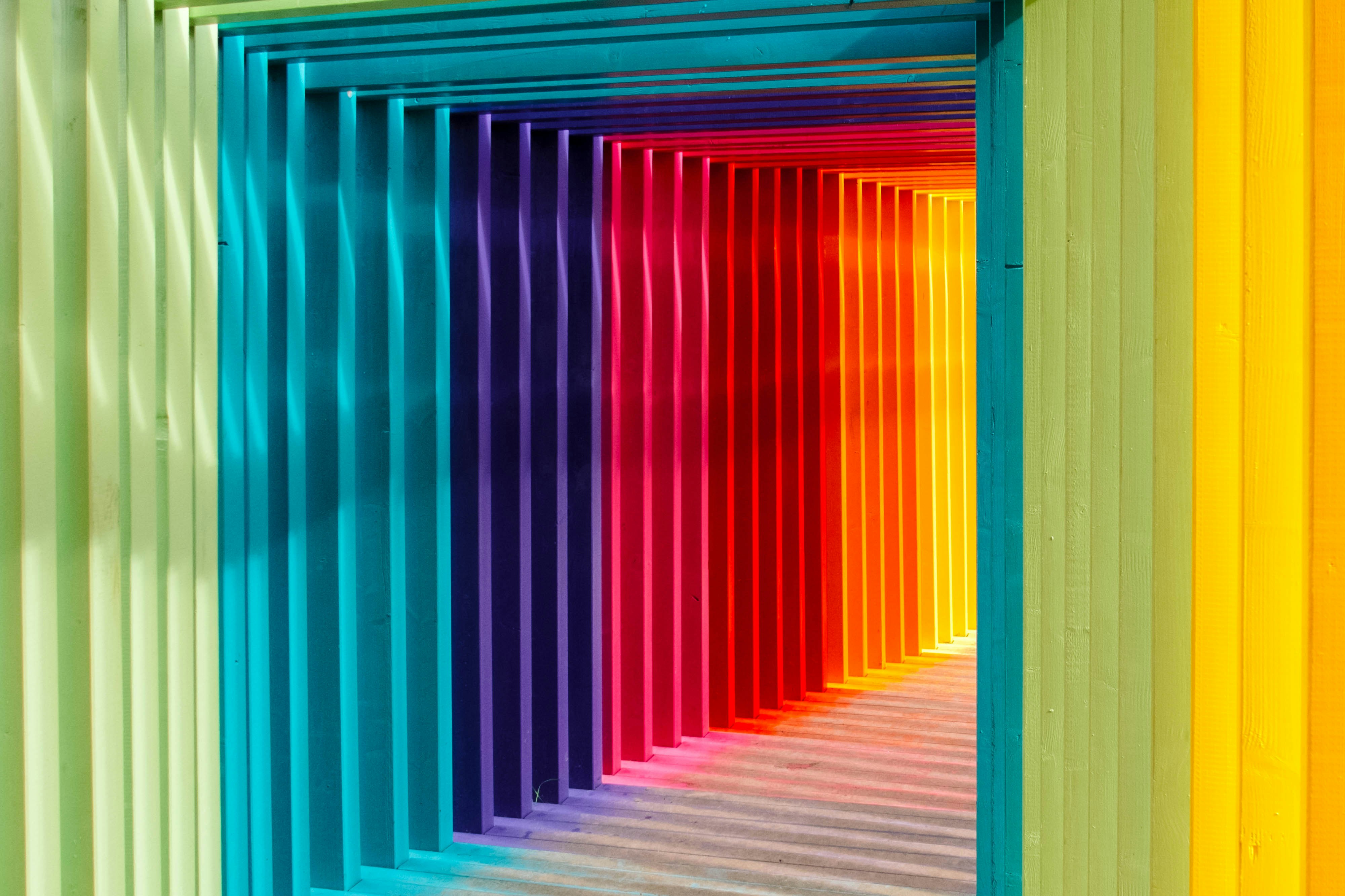
Different colors often trigger different emotional responses:
- Blue creates trust and stability
- Red creates urgency and excitement
- Green represents growth and success
- Yellow feels energetic and optimistic
- Black feels premium and modern
This is why many financial apps use blue while entertainment platforms often use brighter, more energetic colors.
Accessibility and Contrast
Beautiful colors are not enough. Interfaces must also remain accessible.
Low contrast between text and background can make content difficult to read, especially for users with visual impairments.
Designers should test contrast ratios and avoid relying only on color to communicate important information.
For example, showing errors using only red text may not help colorblind users. Adding icons or labels improves clarity.
Dark Mode Trends
Dark mode has become increasingly popular because it reduces eye strain in low-light environments and gives interfaces a modern appearance.
Many developers and designers prefer dark themes because they help content stand out while creating a cleaner visual hierarchy.
However, dark mode requires careful spacing and contrast management. Pure black backgrounds can sometimes feel harsh, so many modern apps use very dark gray instead.
Building a Consistent Palette
A good color system includes:
- Primary colors
- Secondary colors
- Accent colors
- Neutral backgrounds
- Semantic colors for success, warning, and errors
Consistency across these colors improves recognition and creates a more polished experience.
Final Thoughts
Color is not just decoration. It is a communication tool.
Thoughtful color choices improve usability, guide attention, and shape how users emotionally connect with a product.